I've been working on this 8-page superhero comic for a while now. I had the idea for the character in winter of '06/'07, then sat down and actually came up with a story sometime in the early spring of 2007 and have been working on it through the summer, just now finishing up the cover illustration in October of 2007. I thought I'd put together this little web page about my workflow and everything, with some pictures of different steps along the way.
Once I had a basic story idea in mind, I wrote up a rough script, basically describing what would happen on each page, with maybe some dialog snippets or layout ideas if they came to me. I had decided on eight pages as a length: long enough (if just barely) to tell a story, but short enough that I might actually finish the thing.
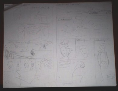
Working from this rough script, I blocked out each page in pencil on half a sheet of printer paper. I sort of drew out where word balloons and other text would go, but as I decided on the actual dialog I would just update it in the written script rather than write it all out really small.
Working from the rough panel layouts I'd come up with during scripting, I laid out each page on the computer in my vector drawing program. I also blocked out all the text for the narration, dialog, and thought bubbles (though not the balloons and bubbles themselves). I used Neale Davidson's free Comic Book font, which is set up so lowercase letters are caps, while uppercase letters are bigger and boldfaced. This is a great time-saver when you're going for that old-fashioned superhero feel where CHARACTERS ARE ALWAYS TALKING LIKE THIS.
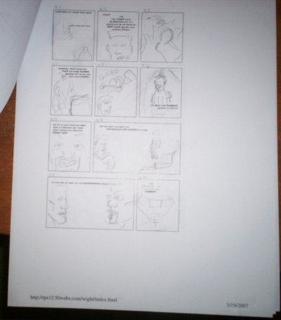
I then printed out each of the bare layouts and storyboarded each page in pencil. Whereas my rough sketches from the scripting step were mostly just identifying who and what would be visible or talking in each panel, now I was deciding on angles and distances, and thinking about transitions and how I would show action. It should be noted that throughout the entire process I was revising constantly: I went back and redrew panels or even sequences of panels, shifted stuff to different pages to make room to insert new material, and even changed dialog during the final lettering.
Now I went through my storyboards and drew out each panel in pencil in my sketch book. I didn't have access to a scanner at this point, so I kept things pretty rough: the shapes should look right, but details wouldn't survive the photography process, so I left all of that until later. I didn't draw at a specific scale, but I'd say most of it was done at about twice the final printing size in the linear dimensions.
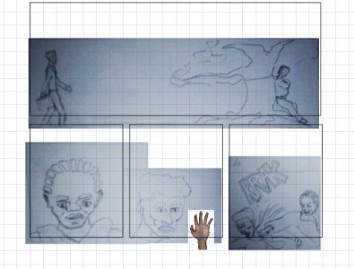
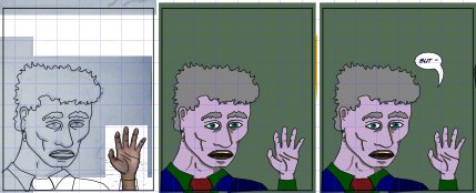
Computer inking, though it would prove to cause me headaches on a few accounts, did offer one benefit during the penciling process: I could "ink" over any image on the computer, not just my pencil drawings. So when I had trouble drawing a hand in a certain position, I could just model one in a poser type program and paste it in, and when I had trouble drawing a police car from memory, I just did an image search and used that.
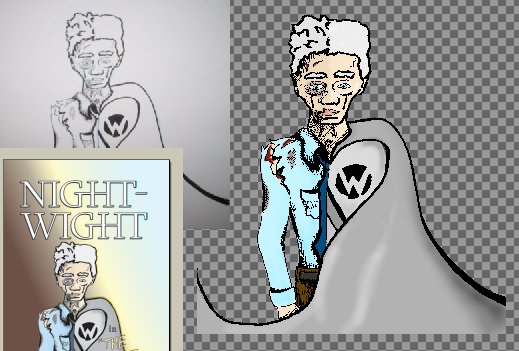
This was where things got tedious. After importing all the panel drawings and cobbling them together in my vector drawing program, I created a new layer and then used the Bezier curve tool to essentially trace over all of my pencil lines with my mouse. Then I'd hide the pencil layer and lay in color regions behind the ink. This was also when I did the word balloons and finalized the text layout.
All of this took absolutely forever. Not only that, but it was pretty much drudgery. I had thought the 50-odd faces I'd had to draw in pencil would get dull, but because they actually required some creative input, they ended up being really fun. Not so with the inking: it was pure tedium.
As I started to see how long this was taking, I started to fear that an eight-page book may have been biting off more than I could chew. I also picked up a blue pencil and some pens and experimented a bit with hand inking: infinitely less painful, and I was very happy with the results, but I was too far along now to start over on Night-Wight so I soldiered forth.
I also hit upon a blog post by someone who suggested listening to audiobooks while doing the real drudgework. I had been listening to music, but audiobooks were immensely better: your mind is actually occupied as you process the words being spoken.
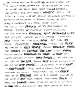
When I was finally done with the inks and colors, I started playing around with hand lettering in a comic-y style. I wasn't great at it, but I thought my efforts looked good enough. My initial reluctance to lettering by hand was on account of how much faster using a font would be. But now I'd sunk so many dozens of hours into inking and coloring that half a day of lettering didn't seem so daunting. Plus, I'd already noted places where the font-generated letters were going to need to be tweaked by hand to look right anyway.
So I just went through panel by panel and filled up three sketch book pages with text. I drew blue pencil lines as size guides, then did the letters in pen, scanned them in, and had my vector drawing program convert the bitmaps to curves. Then I just scaled and moved stuff around until it looked right. The results were pretty good, and actually the hand-drawn look of the letters contrasted nicely with the uniform line weight of the images.
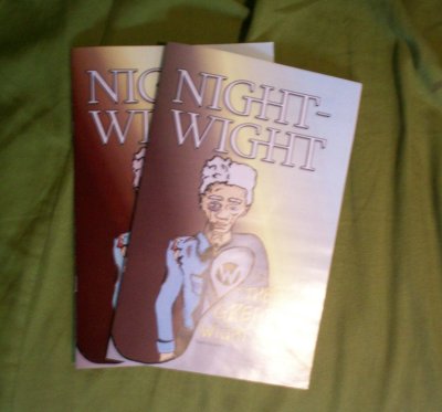
The cover was done just like my mini comic: penciled in blue, inked in pen, then scanned in and colored.
I rendered each page as a bitmap image, then used a desktop publishing program to put them all together as a PDF file. Up to this point (because of limitations of the software I was using), I'd been doing all the colors as RGB (screen) values, but to actually be printed, they'd need to be CMYK. If you have a PDF document set to use the CMYK colorspace then Acrobat Reader will actually do a good job of showing you on your screen how it will look when printed.
I ended up not sweating the difference too much, and I had printed out pages periodically throughout the process, so I had a bit of an idea how the colors would change when printed.
When I thought everything looked the way I wanted it, I sent off the files on CD to ComiXpress, who will do a proof copy for like ten bucks.
Then I got bored waiting to hear back from them and ordered from Ka-Blam instead. I had to format the pages a little differently (larger bleed size and RGB instead of CMYK—they do the conversion themselves), but it was pretty painless. I also used one of those sites that lets you send large files through a web interface, saving myself a trip to the post office. They give a 20% discount for the first order, so I went ahead and ordered 100 rather than sticking to a proof. What's the worst that could happen?
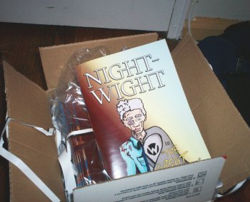
Ka-Blam confirmed receipt of my files three days later, and they billed me four days after that, only a week after I submitted the order. Another week and a half and they had printed and shipped, arriving via USPS just a couple days later. Pretty amazing turnaround time, really: just a day over the three week mark. I couldn't be happier with the printing, either: the colors are much more vivid than anything that came out of my printer, and way nicer than the CMYK PDF files were rendering on my screen. I haven't gone back and compared the printed pages to the RGB screen colors, but they have got to be pretty close. Very cool.
They also list it on their partner site for people to order.
The ComiXpress proof did show up.
They billed me about seven weeks after I placed the order and then it arrived shortly after that. So I think subsequent printings would be a lot faster, it's just that initial wait that made me impatient. The printing quality is good: the colors appear to match the CMYK files closely, but of course that CMYK conversion I'd done on my machine was not as good as the conversion that Ka-Blam did for me, so the colors do look a lot more muted than the Ka-Blam printing. Small text like the copyleft notice on the first page was noticeably sharper than in the Ka-Blam copies, and the grayscale gradient background on the inside front cover looks much smoother.
If I ever do another comic and have the patience (two large ives), I'll definitely consider ComiXpress, provided I can find a better way of converting to CMYK or if I stick to black and white.
Finally, I scanned in the printed book and made a digital version available for download.
